The Procurement Conversation
Podcast graphics
Lead designer on project
Something less corporate.
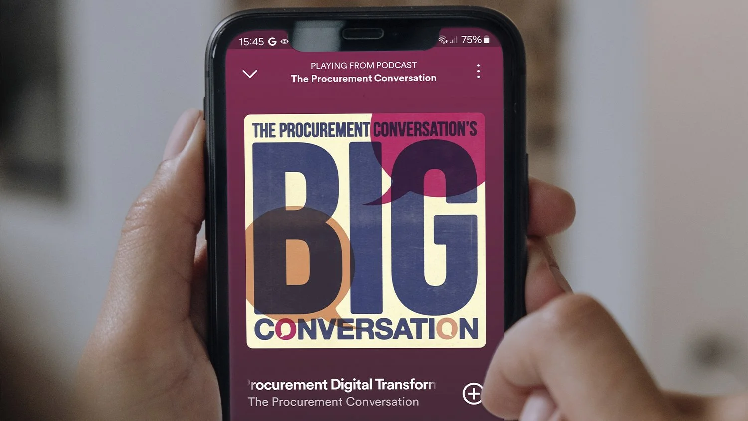
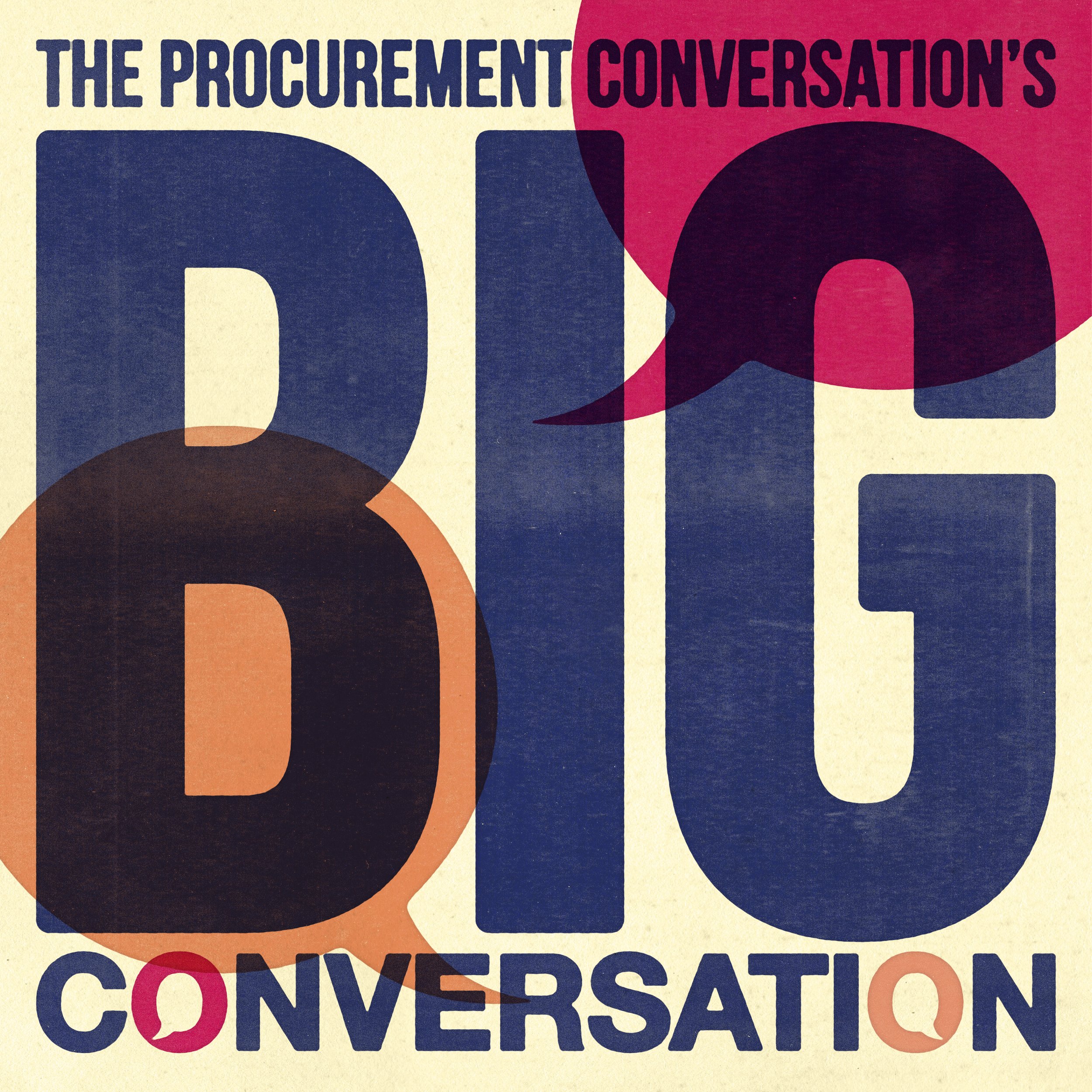
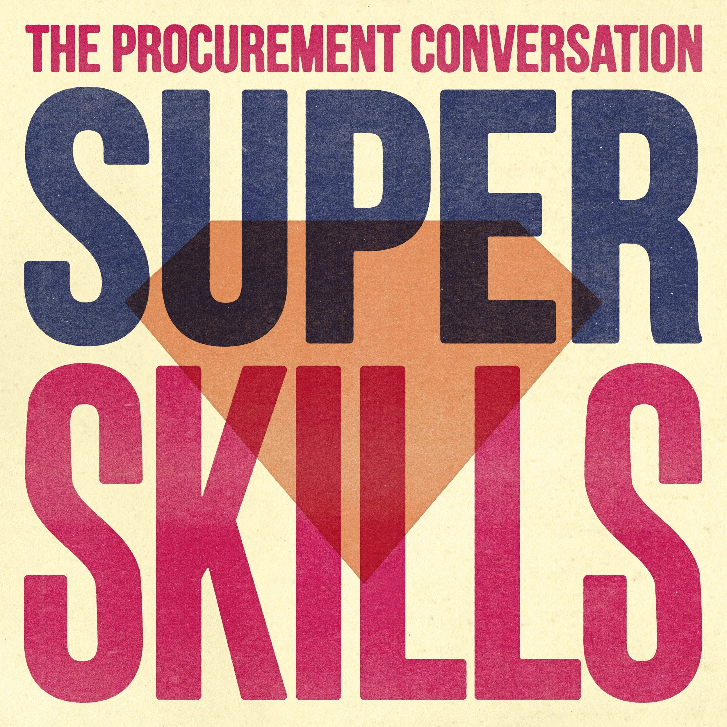
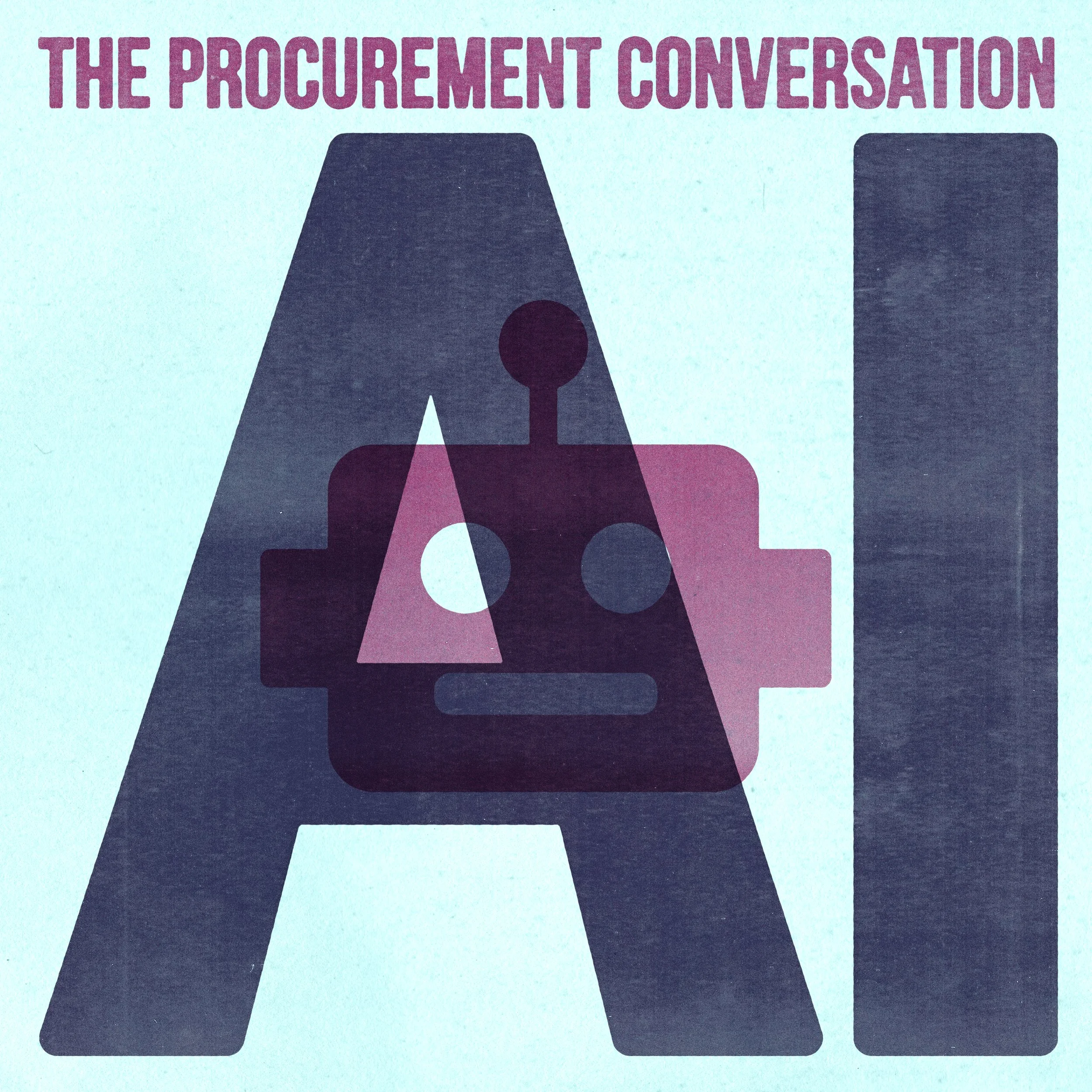
The host of The Procurement Conversation podcast was searching for new assets for their third series, The Big Conversation, where they tackle some of the big issues facing procurement.
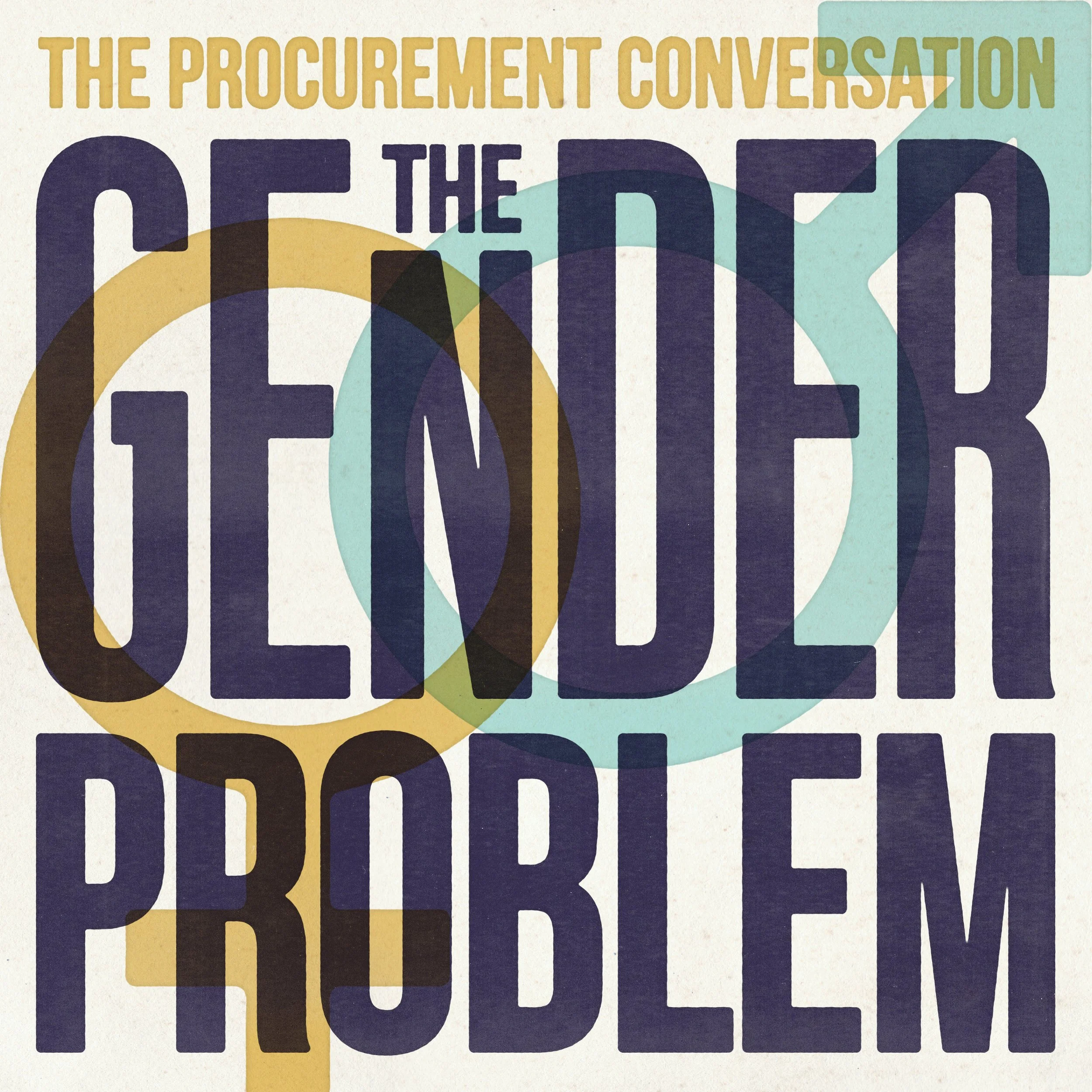
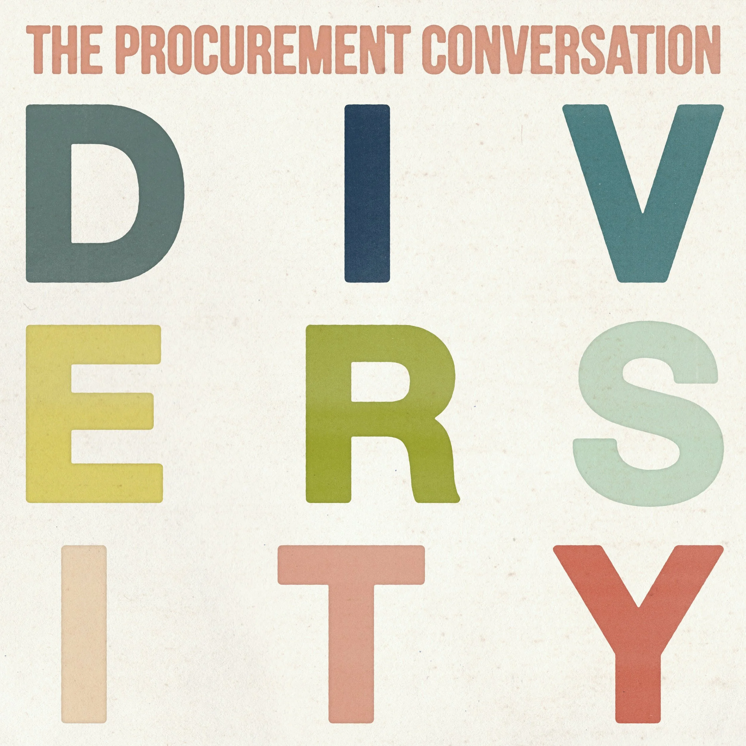
I recommended using a big, bold and colourful typographic style. I also suggested a paper texture for a more tactile feel, which can work well bringing digital-based things into reality. The designs sometimes looked too plain when purely typographic, so I included simple graphic elements. I simulated a screen printing effect, adding a tactile feel and warmth. This allowed for some nice overprinting effects and colour combinations.
The podcast graphics stand out against other B2B podcasts. They gave the host some bold assets to share on social media.

